Quiapo Free designer Aaron Amar’s type? Original, communal, and unmistakably Pinoy
By September Grace Mahino
November 11, 2026
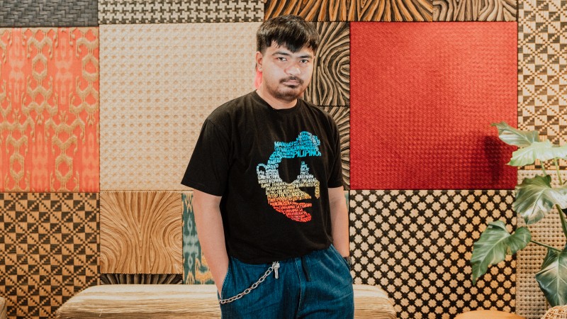
There’s a pretty good chance that anyone reading this article has seen Aaron Amar’s work. In fact, anyone who has looked for fonts that fit the Pinoy vibe would have definitely come across, downloaded, and used one (or more) of his creations. Quiapo Free. Cubao Free. Dangwa Free. Kawit Free. Aside from being named after places within the Greater Manila area, all of these typefaces’ online descriptions close with a definitive statement: “Crafted by Aaron Amar, a proud Filipino.”
It’s a reinforcement of what the graphic and type designer wants to happen, which is to make Filipino design more recognizable and acknowledged globally. “Everyone knows Helvetica and how it was developed by Swiss designers,” Amar tells CREATEPhilippines. “So naisip ko, what if we Filipinos also have a font of our own?”
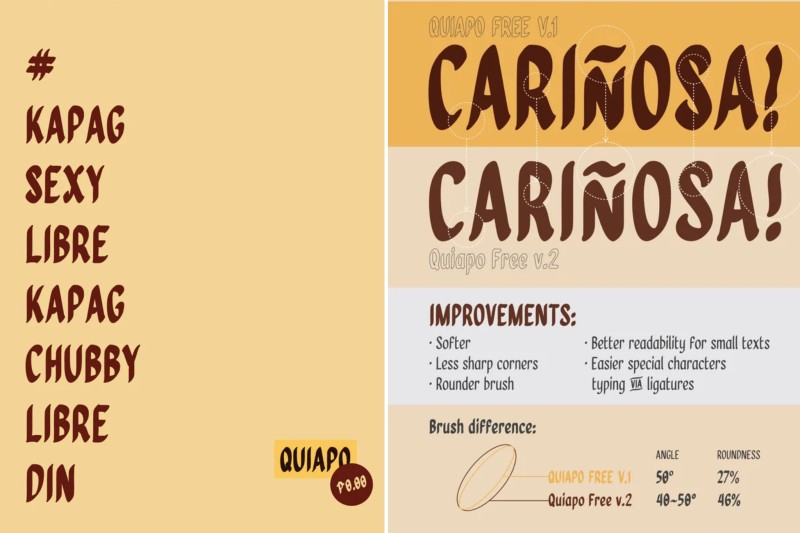
That got him started on exploring and observing local culture more closely. Amar didn’t have to go far to find inspiration, though. The ubiquitous hand-painted signs on the windshields of the jeepneys plying Metro Manila’s roads soon got him developing a type that imitates the strokes created by an ink brush, including the subtle flourishes at the end of each line. It took four years for Amar to finish what is now known as Quiapo Free (the first version), and it is now a font that is immediately associated with the Philippines.
Even better, Filipinos recognize the font as their own, proudly declaring how it reminds them of their chaotic daily commute. There’s nothing chaotic, however, about Quiapo Free’s actual design: Its handcrafted look is an acknowledgment of the painstaking care local artists still apply when writing signboards, letter by letter, with consistency, all in service of helping commuters get to where they’re going.
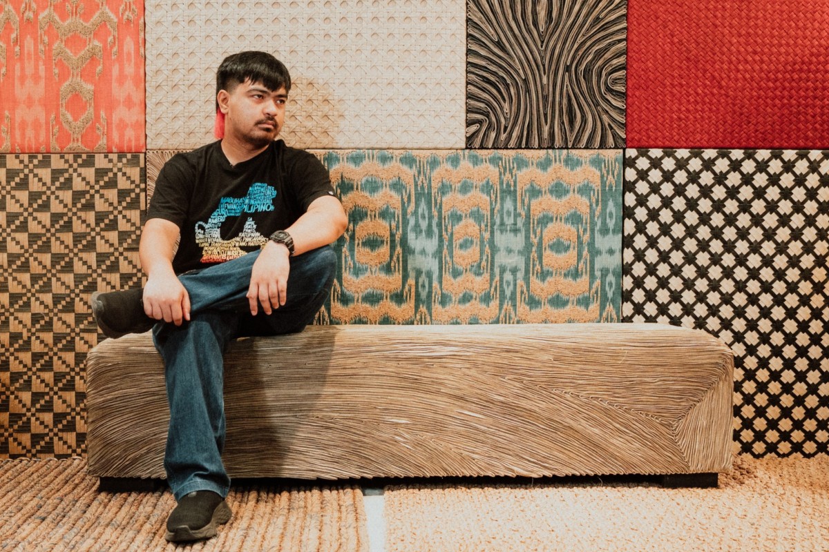
A digital content creator and photographer by profession, Amar got into type design in 2012 initially to find a scene that wasn’t already crowded with talent. “A lot of creatives were mostly focused on illustration and graphic design then,” he recalls. He then explored what interested him the most when designing or appraising another designer’s work, and noticed his keen awareness of fonts. “I started wondering how type designers come up with new ones.”
With no idea if there were available type design workshops or courses available, Amar went the self-study route, scouring the internet for tutorials that could get him started, and soon discovered Fontstrap, a plug-in tool for font creation. “I saw how people would use it to come up with their own font styles and share their creations, and that sparked my interest in creating an original font myself,” he says. “I had no choice but to learn on my own then. Sipag lang talaga at sariling pagkukusa.”
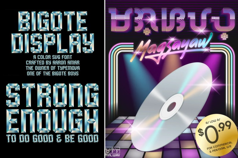
Nearly 14 years later, Amar is a respected name in the Filipino graphic design scene. Aside from continuing to create original typefaces, he champions the growth of type design in the country as the founder of the brand TypeMova, which aims to be the platform for local type designers and artists. He was also one of the organizers behind the inaugural Type Fair PH, an event held in late 2025 to celebrate the Filipino typeface scene.
He remains a keen observer of Pinoy culture as well. Observation is actually key to his creative process, allowing him to create designs that respond to specific and tangible needs. It’s also instrumental in keeping his work distinct in a competitive design industry. “I think that the things that fascinate a designer—or any creative, for that matter—are clues for what they can explore and focus on,” he says. “We’re now in a time where we don’t need to be a jack of all trades; we can each have our own specialization. That way, some of us can focus on specific areas while others cover the rest, and then we can all work together.”
Amar also continues to champion having Filipino culture at the heart of Filipino design. That means going beyond aesthetics to get to the core of what makes a creative concept resonant with the local way of life. He is particularly drawn to diving deeper into Filipino history to find inspiration for his next work, whether it is a new typeface or something else. “Our history is something worth exploring because that adds a lot of context to how we discuss Filipino culture,” he explains. “After all, design ideas and inspirations don’t always come from physical or visible things.”
You began working on Quiapo Free in 2014 and then stopped for a few years before resuming its development and releasing it in 2018. What happened during the four-year gap?
Well, work happened, so I had to shelve Quiapo Free for a while. I also wanted to explore type design as a possible income source, and I didn’t want Quiapo Free to be just a one-off creation.
When I temporarily stopped working on Quiapo Free, I tried exploring other types. I also created commercial-ready fonts that became available on Canva. These are Jeboy and Alta.
Why make Quiapo Free available for download at no cost, unlike your other fonts?
Actually, I wasn’t thinking of recognition or rewards when I was creating Quiapo Free. That’s because the concept behind it wasn’t originally mine. The font has its own style, but that is based on an already-existing hand-painted lettering. I mean, first of all, I’m not a lettering artist. No one in my family is a lettering artist. I was just inspired by the work of lettering artists, and that’s why I made Quiapo Free free.
There’s another reason why I didn’t monetize the font. Most graphic artists, especially those who are just starting out, tend to use free fonts since they don’t have much money to spend on paid ones. So, making it free was my way of helping more people explore or experience a Filipino vibe-based font instead of using only what’s popular or already available. Napansin ko din kasi na people weren’t as conscious then about the fonts they used when doing graphic design. Type was usually the last thing they’d think of. Sharing Quiapo Free was my way of encouraging the public to also think about this important element of design.
You have since released other free typefaces based on a similar idea: Cubao Free, Dangwa Free, Kawit Free. What differentiates each one from the others? And how did you pick the places to name each font after?
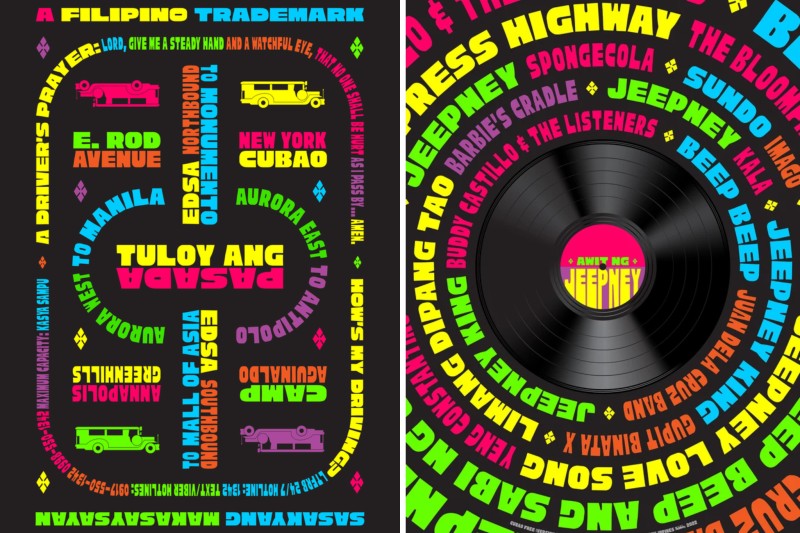
Quiapo Free was inspired by the signage I’d see on the jeepneys plying the routes around Manila City, particularly Quiapo. Actually, a lot of routes pass through Quiapo. Cubao is the same, with different jeepney and bus routes passing through it.
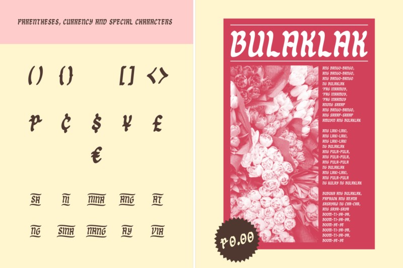
Hand-painted signs aren’t limited to public vehicles, though. We see them on the facades of small businesses, too, like in Dangwa. That’s where Dangwa Free came from, and the font is softer, curvier because Dangwa is known for its flower shops.
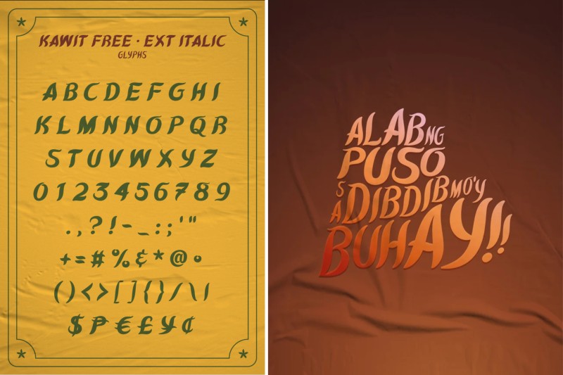
As for Kawit Free, its brush italic design is based on the emblems and seals of traditional government agencies, symbolizing Kawit’s prominence in the history of Philippine independence.
You’ve basically started a universe of Filipino fonts. Will there be more additions, given how diverse Pinoy culture is?
Maybe if I have the time again, I would explore more types. But then again, I also want other designers to have this platform and do something with it. That way, those who want to explore type design can also contribute to the growth of Philippine-based fonts. I don’t want it to be just me.
What has been the best feedback you’ve received about the typefaces you’ve created that made you realize all the work has been worth it?
What makes me really happy is to see how my work has helped aspiring graphic artists, since that was my original goal. I’m glad to hear that I’ve somehow helped others appreciate the art of type design and inspire them to do graphic design, especially work that is distinctly Filipino.
Of course, I’m not the only one doing that. I was fortunate to release Quiapo Free at the time I did because I think that was the time when the bigger discussion of how to define or describe Filipino design started. Somehow, my work became one of the examples that demonstrated how artists and designers can explore what we already have in our own culture, in our daily environments.
As someone who has carved your own place within the design industry, what advice can you give young designers who want to find their niche where they can do work without stifling their creative curiosity?
Be curious. Be more observant. Create something that has value or meaning to it, and consider making something that can give back to the people around you.
Like I’ve said, designers shouldn’t be afraid to focus on what interests them. They can explore what makes them curious since we have the internet that lets us discover different works for free and research how others do the work we’re also interested in doing.
Of course, once they start planning to create something using an already-existing craft or piece of media, they must try to explore infusing their own artistic sensibilities into their work. Experiment with what would bring their vision to reality the best.
What about aspiring type designers, specifically? What can you tell them?
Naturally, I hope more young designers will have the courage to explore type design, even if it’s just one time. I’d advise them to connect with other type designers and share how they felt through the process, their observations while developing each letter and fixating on the spacing and kerning. They can talk, too, about how the typeface they’re creating can help enhance a design or an artwork.
One thing I’m sure of is that it isn’t easy. Actually, no design work is easy, least of all type design. But once you’ve completed a set, it’s very, very fulfilling.
***
Discover more of Aaron Amar’s original typefaces on his Behance page and follow him on Instagram.
Want to connect with Aaron? Get in touch by filling out the Connect with a Creative form. Want to be part of our creative community and have the chance to be featured on CREATEPhilippines? Sign up and register for our Directory of Creatives here. Join our Viber community, too, and follow us on Instagram, Facebook, X, and LinkedIn to be updated on the creative events that we’re promoting.
Photos by Beatty Lyn Santos.